

Units for the CSS can be categorised into absolute and relative.
MDN documentation made a very solid tables, so please have a look :) Absolute length units — they are not relative to anything else, and are generally considered to always be the same size.
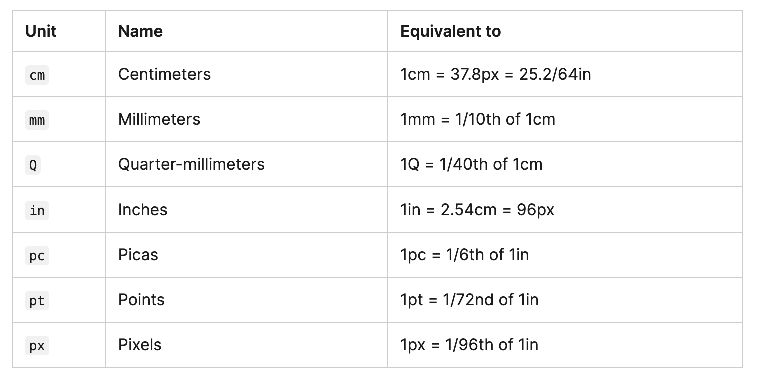
Most of them here aren't typically used. For instance, we would barely use cm (centimeters) on screen. The only value that you will commonly use is px (pixels).
Most of these units are more useful when used for print, rather than screen output. For example, we don't typically use cm (centimeters) on screen. T he only value that you will commonly use is px (pixels).Relative length units?
Relative length units are relative to something else, perhaps the size of the parent element's font, or the size of the viewport.
The benefit of using relative units is that with some careful planning you can make it so the size of text or other elements scales relative to
everything else on the page.
(from MDN)
If you already saw MDN document that I linked above, you would see there are many different relative units. I would like to introduce a few units that are commonly used on the web, rather than going through all of them.
em: Font size of the parent, in the case of typographical properties like font-size, and font size of the element itself, in the case of other properties like width.
rem: Font size of the root element.
vw: 1% of the viewport's width.
vh: 1% of the viewport's height.
% (Percentages):
In a lot of cases, a percentage is treated in the same way as a length.
The thing with percentages is that they are always set relative to some other value.
For example, if you set an element's font-size as a percentage, it will be a percentage of the font-size of the element's parent.
If you use a percentage for a width value, it will be a percentage of the width of the parent.
I know em and rem can be confusing. Please have a look this document from Digital Ocean:rem VS em
Throughout some trials and errors, I've found some patterns in which case I tend to use %, px, %, vh... I created a page to show you some examples.
(If you want, download a zip file for this explanation here and playaround.)
So this is a html structure that I made for this page.
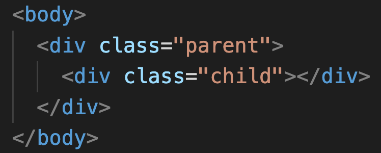
Here I created a parent div box, and a child div inside of the parent.
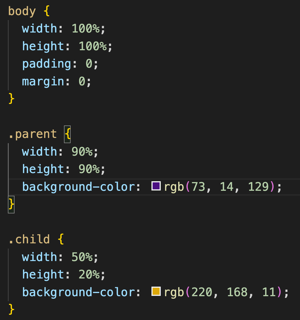
It's a good practice to start designating the width and height of 〈body〉, before you made the settings on the elements inside.
The way how you set the width and height for the body really depends on your page size that you wanna make.
As for the height, you'll mostly use %, vh, and 'auto'. The difference between 'auto' is height: 100% gives the element 100% height of its parent container. height: auto means the element height will depend upon the height of its children.