

To put it simple words, Media Query allows you to work on Responsive Web Design!
With an image below, you'll be able to directly notice why it's important. Let me open the beyonce.html file that I played around in the 1st & 2nd pages.
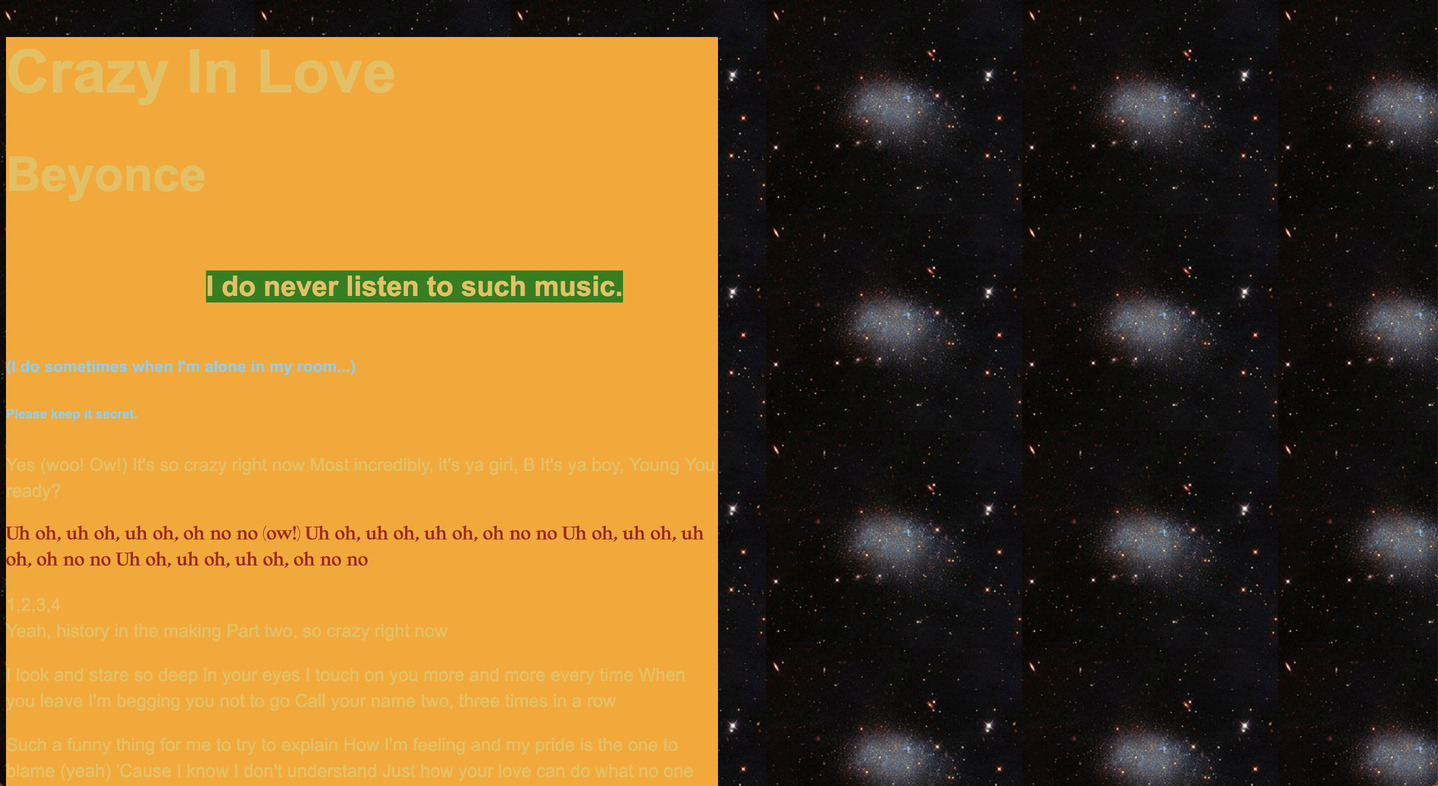
Remember this page? (This is a simple page that I showed you before. Please understand if there are some style changes :p)
But then how does it look like on mobile devices? You can already check the appearance. Go to a webpage that you are working on. Then click a right side of your mouse! You'll be able to see an option 'Inspect', or 'Inspector'.
You'll be able to see this kind of interface below:
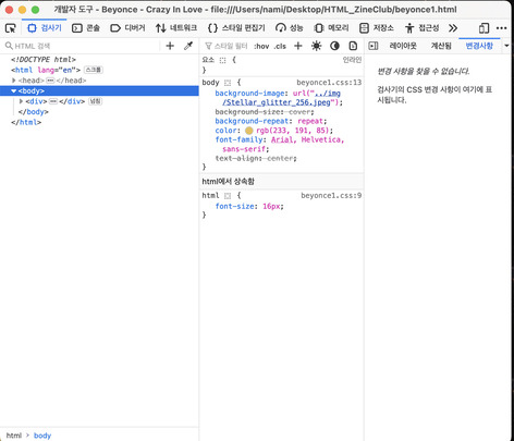
Don't worry if interface that you have looks slightly different with mine. It can look different depends which browsers you use, and if the developer tool(inspector) is opened in inside of the browser, or outside. You can choose how it wants to look like. I chose it to be opened externally.
From the developer tool interface, you'll be able to find a visual icon that looks like 'mobile screen'-ish. You're able to select different devices and it will show you how your webpage looks like from the device you select.

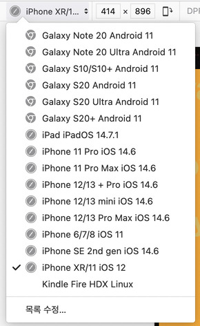
Okay, I selected a viewport of IPhone XR. Then....
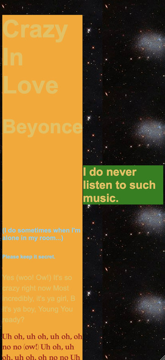 🫢
🫢
Yes I do know, this is embrassing. No one would think this looks great on the mobile screen.
This is one of the most common case that you will have to use Media Query.
I found a nice documentation about the Media Query from CSS-Tricks, written by Andrés Galante.
According to Galante:
Media queries can modify the appearance (and even behavior) or a
website or app based on a matched set of conditions about the user’s
device, browser or system settings. CSS Media queries are a way to
target browser by certain characteristics, features, and user
preferences, then apply styles or run other code based on those
things.